

 Both cards began entirely as white paper. To color the images, I first stamped them in light ink (Tea Dye Distress Ink) and then colored on top of the stamping using colored pencils. I added a light layer of Brushed Corduroy Distress Ink on top of my coloring. On the floral card, I also stamped the Hero Arts grid background after coloring using Brushed Corduroy Distress Ink. I removed some ink with a baby wipe before stamping. The green ink used on the background of the card with the leaves is Forest Moss Distress Ink, both for inking the the paper and stamping the Envelope Pattern background.
Thanks for popping by! See you next year :) with a fun Purple Onion Designs card.
All Stamps Hero Arts (Card #1: S5435, CG248, CL491) (Card #2 CL497, CL477, S5507)
All Stamps Hero Arts (Card #1: S5435, CG248, CL491) (Card #2 CL497, CL477, S5507)

 Okay, this just couldn't be prettier! First of all, Wanda's coloring on the tulips is perfection!! And talk about an eye-catching background...the text paper is wonderful. Finally, I love all of the finishing touches Wanda has added to this card-from the ribbon to the heart charm, it all adds up to a beauty!!
 Thanks again for visiting and commenting this week! You guys are the best!!! See you Saturday with some more inspiration...Purple Onion Designs style! :)
 And here's my take:
 This is so cute I could just squeal! :) I love the perfectly colored images on the circle-very unique. And the colors are so fun. Lately I just can't get enough of orange and teal. You just can't help but smile when you look at Wanda's card!
 Such a charmer! I love all of the vintage layers on this cute card. The vintage bird, flowers, torn paper, flourish background...they are just so sweet! I also love the way Wanda has added the sentiment on the torn and layered pieces of paper.


 Details on original post
 And here was my take:
  Details on original post
  This card began entirely as white paper and was crafted using several of the new items from the line--Pitt Pastel Pencils for the background behind the flowers, Art Grip Aquarelle Pencils, and Color Gelatos. (Yep, you heard me right-- Color Gelatos-- and trust me, they are as fun to use as they sound!!)
  Be sure to pop over to the
  And here's the video (click
  And here was my take:
 Details on original post
  And here was my take:
 Details on original post
  And here was my take:
 This card demonstrates how simple stamping can be truly elegant and beautiful! I love the way Tami has stamped the flowers off to the right hand side of the card. Her colors are so very natural and appealing. And the polka dot paper adds just the right touch of whimsy to her card!
 And, sweet Tami, I'm sending YOU big hugs! Thanks for being such a wonderful inspiration and voice of encouragement for so many stampers. You're one in a million!!!
 See you tomorrow with our last card by Tami. I'm so sad to see the week coming to an end... :(
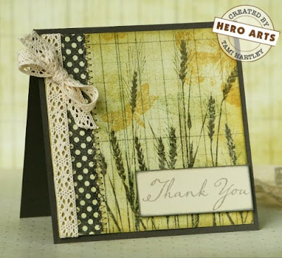 I really cannot get enough of all of the luscious stamping on Tami's card! There are so many subtle layers that all add up to LOTS of gorgeousness!! And the touch of lace along the side is the perfect embellishment!
 And while I had my rose stamp out, I also made this card and video for my local scrapbook store,
  And the video. To see the full shot of the video, click
  This Christmas card is PURE elegance! I love the embossed Christmas tree and inky background tree that take center stage on this charmer. The musical note background adds to the holiday feeling and Tami never forgets the little details--distressed edges, stitching, button, and lace...I could go on and on!
 And so you can truly appreciate the genius of her card, here's the set that she used to create that stunning bouquet:
 I LOVE the way Tami altered the flowers, stems, and leaves to create this fun card! She made me fall in love with this set all over again. Her bright colors are incredibly happy and look wonderful against the tan and kraft backgrounds. And speaking of backgrounds, I love how she has stamped the flowers repeatedly to make that charming background paper.Here's my take:
 Isn't Hannah's snowman clever?! What a great use of buttons! And I love the nontraditional holiday colors. They really add to the playful feeling of this card. Finally, Hannah's card design is well balanced and fun-- a great starting point for any card!
 Thanks
  Hannah's butterfly could not be more beautiful! I LOVE her unexpected color scheme of peaches, pinks, and purples. They really pop against the white background. And speaking of backgrounds, the rich purple card base is the perfect choice as it allows the image and sentiment to be the stars of the show!
 Here is my take. After seeing Hannah's card, I just had to make something with those brilliant oranges:
 Thanks again for stopping by! See you tomorrow with another of Hannah's stunning creations!
 Okay, this has to be one of the absolute SWEETEST cards I've ever seen. Hannah's scene with the mama and baby bird is precious. The sentiment works perfectly, too! Hannah has done a great job with this layout. I love the center panel matted on the darker cardstock and layered on the pink/salmon colored background.
 And the video:
 Get out your sunglasses! :) Here's my card:


