 Isn't this the prettiest girly card? I love the light pink background which has been stamped every so subtle with the Hero Arts Floating Flowers stamp. The bold white panel contrasts perfectly and the darker pink borders add a great finishing touch! And those butterflies- EXTRA cute with the embroidery floss centers. Such a great idea.
Here is my take: Supplies--Stamps: Sentiment (Hero Arts CG132), Sentiment Background (Hero Arts S5213), Grass (Stampin' Up); Inks: Black Ink (Stampin' Up), Distress Ink (Tim Holtz/Ranger); Other: Butterfly Punches (MM Slice, Martha Stewart, Fiskars), Misc. Cardstock and Embroidery Floss


 Thanks so much for stopping by! I just know you will ADORE Sarah's creations this week! She's one talented stamping chica! ;)
 I love the teal and green color scheme Carole has used on this card! She has created the perfect mix of patterned paper AND stamping! And the pretty bow with button and twine is such an appealing embellishment. Finally, the overall design of this card is one of beauty and balance. Carole, I just can't get enough of your cards!
 Thanks again everyone for stopping by this week and leaving such heartfelt comments. You always make my day!!! And, BIG thanks to Carole for allowing me to share your works of art in my little corner of blogland. :)
 I love the sweet, simplicity of this design! The bright flowers are perfectly colored and the dainty pearls make the perfect centers. The butterflies add a touch of whimsy and the watercolor effect adds to the appeal of this card! Finally, who can resist that splendid, big, white bow??!!
 See you tomorrow, my bloggin' buddies, for our last day with Carole!
 This colorful collection of hearts and buttons is sooooo FUN! The bright colors "pop" against the kraft background. The patterns on the hearts provide the perfect texture. As always, Carole never forgets the details like the twine and pink ribbon! Finally, the banners are the perfect way to display the beautiful sentiment!
 Okay, pick your jaw up off the floor, my friends!! :) Isn't this awesome?? I love the beautiful butterfly sitting on that great background. The background reminds me of an abstract painting--so fun and unique and not often seen on cards! Carole also has created a lovely balance to this card by combining stickers, stamping, and embellishments!
 Thanks again for stopping by!
 See you tomorrow, my friends!
 This soft, delicate beauty just takes my breath away! I love the shadow stamping behind the fern. And the torn vellum for the sentiment is extra FAB! Carole is a master of the clean and simple style and this creation is so calming and pleasing to the eye!
 Thanks for stopping by! See you tomorrow with another Carole-ish card! :)
 The first thing that caught my eye on this card was the creative way Anette included the sentiment! What a great idea to stamp it on the leaf of the flower. The ribbon makes a beautiful stem and the color of the flower is to die for! Love it's brightness and coral color! Finally, the flourishes add an elegant touch!
 Thanks for stopping by today and for all of your awesome comments this week! Thanks, also, to
 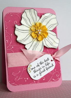 Once again, Anette has created quite the stunner with that big, bold flower! The crackle finish on the flower seems to glisten in the sun. I can only imagine the effect in real life!! Anette has chosen the perfect sentiment and she has attached it to that pretty ribbon perfectly!
 Thanks again for stopping by! See you tomorrow with our last inspiration card from Anette!
 Anette has done it again with a superb color scheme! The alcohol inked background adds a subtle texture to the flower. The light distressing on the panel with the sentiment gives off a nice glow and warmth. Finally, the small pearls tie the whole design together! Anette, you are just too good! :)
 First of all I just LOVE the color scheme- orange and purple with a touch of blue. AWESOME! The butterfly goes great with the birthday cake center panel. And check out all that glitter! Fun! Finally, the orange background with polka dots is such a bold choice!
 See you tomorrow with another great card by Anette. Thanks again for your comments and encouragement! You are all the BEST!
 This card is like a pretty painting! I just can't get over her beautiful sky--complete with a subtle flourish that reminds me of a quiet, soft summer breeze. And that butterfly trail adds to the bright, airy feeling this stunning card evokes!
 See you tomorrow! :)
 I adore this vibrant flower. Anette's shading makes it appear as if it is glowing from the center. The subtle text background helps the big flower remain the star of the show! This is just such a fresh, cheery card that is destined to bring a big smile to its recipient.
 Thanks again for stopping by, my friends! See you tomorrow!

 I can't get enough of Jacqueline's grid cards! Each square of the grid is like a mini-masterpiece filled with beautiful stamping, vintage photos, fun embellishments... AMAZING! I love the minty, soft green on this card. It's soooo soothing! And Jacqueline does such a wonderful job of creating a design that is filled with many different patterns but also feels balanced and harmonious!
 I love this wreath of pretty flowers! The paper piecing adds wonderful texture and shading. Jacqueline's color choices of flowers really "pop" against the light background! I love how she has used the same flower stamp for both the background AND the flowers in the wreath. Finally, the text in the center of the wreath adds such an elegant touch!
 Is this not one of the prettiest cards you've ever seen??!! First of all, it's full of butterflies, and you all know how I feel about them... :) The colors are soft and serene. Jacqueline is so good at mixing different patterns, prints, and images and this card definitely shows off her skills! And I love all of the finishing touches she added here- pearls, gems, decorative punches, and a touch of distressing!
 Thanks again for stopping by! Enjoy the Superbowl, all of my fellow football fans! I'm hoping to see lots of funny commercials! :)
 To begin with, I love the soft, distressed background. The muted colors provide the perfect backdrop for those VIBRANT, stunning RED butterflies!! The touches of black on the poppies and the sentiment tie everything together. Finally, the pearls are perfect, sweet, and pretty embellishments!
 Thanks for stopping by! I can't wait to share more of Jacqueline's simply GORGEOUS cards--I hope you'll stop back tomorrow! :)


 Thanks again for stopping by! I'll see you tomorrow with our next featured stamper. She's got a style all her own and I just know you will LOVE her cards!
 I love the beautiful simplicity of this design! The black, white, and teal color combo really draws attention to the beautiful image. Clare's nontraditional color for leaves is so eye-catching! I also love the way Clare layered her torn edge against the black cardstock which adds to the texture and handmade feel of the card! Finally, I can't think of a better embellishment than one of Clare's bows!
 Don't you just love the way Clare uses her die cuts?? This is so innovative! I love the red and grey color combo! The colorblocking using pp adds great visual interest. And this card also has another of my favorite Clare trademarks-- a perfectly tied and perfectly placed bow!
 See you tomorrow with our last card from Clare!
 This grouping of fluttering friends is just too sweet! I love the light pink color with the pretty pearls. Clare adds such nice dimension to her cards, too! And finally, I love Clare's bold use of a BIG ribbon tied on the side! Keep the butterfly cards a comin', Clare!!
  Thanks again for stopping by! See you tomorrow. :)
 This card is so soft and sweet! I just can't get enough of Clare's shaped/die cut cards! The pink and brown are a great color combo. Finally, I love the playful touches Clare adds to this card like the big bow and fun butterfly trail which includes the sentiment!
 Thanks again for stopping by, my friends! I hope I will see you tomorrow with another terrific card by Clare!!