 I'm in butterfly heaven when I look at this page! How I love the unique color scheme and collection of butterflies flying up the left side of the page! The subtle title looks perfect against the dark woodgrain background. And Nichol's photos are soooo cute. The speech bubble embellishements add to this page's appeal and draws one's eyes to the photos. Finally, Nichol's pages are always full of the details that make them so special, for example, a subtle scallop along the pink and green/teal woodgrain papers, rounded corners, fun die cuts, and a great place for journaling.
Here's my take:
 Stamps: Vintage Butterflies (Purple Onion Designs), Hero Arts (CL380), Woodgrain (All Night Media)

 Too cute; right? To begin with, I love the design of this card- the green and yellow panels in the background, a central panel, and the fun colorful banner at the bottom. Nichol's coloring is out of this world. She is such a pro at shading and blending. I also love the way she has masked the image of the little boy so she could add those soft subtle clouds behind him. Finally, the twine and buttons are the perfect finishing touch!
 Thanks soooo much for stopping by! :) See you tomorrow with another FAB card (hhmmm...or maybe a scrapbook page....) by Nichol!
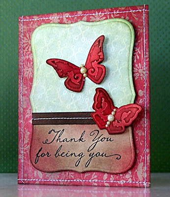
 Happy. Happy. Happy. This card is just soooo HAPPY! I love it and it makes me smile. The bright fun colors are beautiful! I also love those little red butterflies. Stamping the bright flowers on white really makes them "pop" and is such a great design idea! Finally, I adore the delicate stitching on each side of the center panel- FAB touch!
 BIG thanks to Natalie for allowing me to share her truly stunning cards on my blog this week. It's been an honor for me! :) To see more of Natalie's awesome work, you can visit her
  And here's my take:
 Be sure to stop by tomorrow for our last card with Natalie! :)
 The first thing that caught my eye about this card was the lovely mixture of stamps and colors. This is stamp layering at its best! I love the light blue text and small orange butterflies. And the pink hydrangea couldn't be prettier. Natalie has such an eye for details, too, like the stitching and pretty ribbon on this stunner!
 This card has such a lovely layout/design. The images look so nice off to the left with a clean and simple space on the right for the sentiment. The orange poppies contrast perfectly with the blue sky. Natalie has done a great job cutting out the detailed flowers, too! And aren't those pearls by the sentiment the perfect finishing touch?
 Thanks again for visiting and leaving such awesome comments! :)
 To begin with, isn't that photo beautiful? I love the outdoor background! Next, Natalie's card is so pretty and tender. I love the way she has positioned the birds on the branch. The music notes add a whimsical feeling and coordinate perfectly with the sentiment. Finally, the woodgrain background and neutral color scheme create such a charming, natural look!
 And now if you haven't visited her blog before,
  Is your jaw still on the floor?? Mine is! This card is one of my all-time favs! Nancy has done an incredible job coloring the flowers. I love the soft, sweet tones she has used. The touch of lace is PERFECT. I also love the way she has added the sentiment. Seriously, I just can't get over how pretty this is!!


 Thanks again to all of you who stop by to visit! You are ALL the best! Thanks again, Linda, for the wonderful inspiration! :)
 See you tomorrow for our last day of inspiration with Linda. HUGS!
 This is so natural and appealing! Linda has done a fantastic job layering the beautiful fern stamps onto the subtle polka dot background! Her flower adds to the natural appeal of this card. I really love the touch of the pinkish peach color of the flower against the more masculine colors of the background. And the black string is the perfect finishing detail!
 Thanks for popping by! HUGS!
 See you tomorrow! Thanks for all of your wonderful comments!
 This has to be one of the most clever cards EVER! Don't you love the way Linda has used the oranges to make a flower? WOW! The bright colors and green center are so cheery. I love the way Linda has layered the flower center and used a perfectly placed brad to finish it off. Finally, the big ribbon makes the perfect "leaves!"
 This card is such a little treasure! I really love the pairing of the natural flower with the graphic background text. The bright oranges and yellow of the flower really "pop" against the white/grey background. The orange border compliments the flower stamp, too! And the one rounded corner is a subtle, yet very effective detail.


 One of the first things that caught my attention about this card is the overall design. The stripes on top, the sentiment between the two thin pieces of colored paper, and the text on the bottom all adds up to such a balanced layout with limitless possibilities. Next, this card has such a bold and unique color scheme. I love the mix of brown, black and red. Finally, Anita has given this card a lovely shape by adding the scallops on the bottom!
 Thanks for popping by!

 You know I can't resist a card with butterflies--and this one is pure perfection! Anita's color scheme is sooo pretty! I love the pink, aqua, and craft together. I also really love the white stamping on kraft. Such a subtle, yet eye catching look. The coloring of Anita's butterflies shows off her talent at shading. Finally, Anita's choice to add a scallop at the bottom of this card is such a wonderful finishing touch!
 Thanks again for stopping by! See you tomorrow with another one of Anita's awesome creations!
 And this last one is my personal favorite of the group. I have to thank my good friend,
  Thanks for stopping by and I'll see you on Monday with our next "Inspired by..." stamper.
 This card is just too adorable! I love the fun beach scene and equally fun sentiment. Once again, Kelly's coloring has blown me away. The bright colors of her card add to it's happy look. Finally, the torn paper makes a great textural beach!
 And here is my take:


 Thanks again for popping by and leaving me such sweet, sweet comments!